Saturday, 22 December 2012

Assignment 3: Colour

This purpose of this assignment is to show how certain colour combinations and ratios can be useful in creating strong images.


Colour harmony through complementary colours:

'Complementary' colours are colours which are opposite each other on the 'Colour Circle'


Violet twilight sky with autumnal yellow leaves and streetlight:
Canon 5Dii MF 28mm f.2.8 1/80 iso1000 


I saw this scene from about a mile away, and only having a fixed 35mm equivalent lens, had to put in some serious legwork to fill the frame as I wanted.
 Fujifilm X100 35mm f.11 1/125 iso640

Shot through the windscreen (I wasn't driving!).
Canon 5Dii MF 28mm f.2.8 1/100 iso500


Little red riding hood.
Canon 5Dii MF 28mm f.2.8 1/200 iso100 


Colour harmony through similar colours:

I think this shot captures the colours of autumn really well.
Canon 5Dii 28mm MF f.2.8 1/80 iso400


A cold, grey morning over the Tyne.
Fujifilm X100 35mm f.2.8 1/750 iso200


Fujifilm X100 35mm f.4 0.15 iso200


I think the muted colours in this sit well together.
Fujifilm X100 35mm f.2 1/90 iso1000


Fiery colours.
Canon 5Dii 50mm f.1.6 1/50 iso1600

Colour contrast through contrasting colours:

Contrasting colours are those which sit roughly a third of the way round the colour circle from each other .


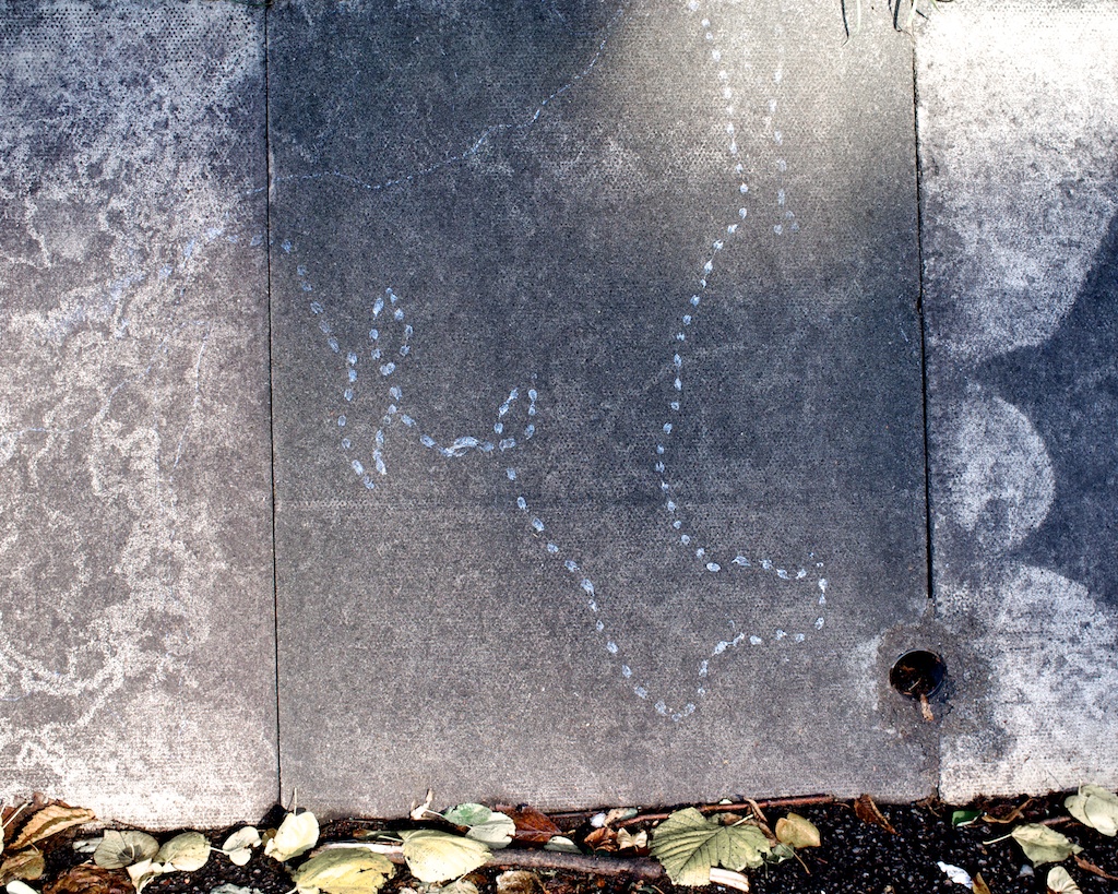
I love the cracks in this, and that one of the colours is provided by the lighting.
Canon 5Dii 50mm f.1.4 1/160 iso500


Each of the primary colours, with the brighter yellow occupying less of the frame.
 Fujifilm X100 35mm f.4 0.1 iso400

Another example of the the three primary colours.
 Fujifilm X100 35mm f.2.8 1/220 iso200

I love how the orange cigarette butts sit against the purpley-red chair. This is probably my favourite image in this assignment.
Canon 5Dii 50mm f.2 1/400 iso800


Fujifilm X100 35mm f.16 1/60 iso200


Fujifilm X100 35mm f.2.8 1/125 iso1250


I think the way the frame is divided into solid chunks of colour here is really striking.
Fujifilm X100 35mm f.2 1/40 iso1250


Colour accent: 


A small area of colour, either harmonious or contrasting, against a large background.


Simple but effective.
Fujifilm X100 35mm f.8 1/1500 iso200


Not sure if  the purpose of this window display is to sell children's clothes or promote a Japanese horror  film.
Canon 5Dii 50mm f.2 1/1600 iso500


This almost looks like I've done some nasty selective colour type processing, but the only thing I've done in post is small S curve to boost the contrast.
Canon 5Dii 28mm MF f.2.8 1/500 iso200 


Not bad for a £10 lens!
Canon 5Dii 135mm MF f.2.8 1/200 iso500 

Reflection:

I thoroughly enjoyed this assignment. I suppose colour is a large part of how I shoot naturally, and it's been really interesting to think about the theory behind it.

Exercise: Colours into tones in black and white

This exercise demonstrates how different coloured filters (in this case digital, but the theory is the same for film) can provide control over the tone of areas in black and white photography.


Top L-R: Original, No Filter
Middle L-R: Yellow Filter, Red Filter
Bottom L-R: Blue Filter, Green Filter

Exercise: Primary and secondary colours

A photograph for each of the primary and secondary colours:


Canon 5Dii 28mm f.2.8 1/200 iso320


Canon 5Dii 24mm f.2.8 1/320 iso800


Fujifilm X100 35mm f.3.6 1/125 iso1250


Canon 5Dii 50mm f.1.8 1/400 iso1000


Fujifilm X100 35mm f.4 1/125 iso640


Canon 5Dii 28mm f.2.8 1/100 iso400


Friday, 21 December 2012

Exercise: Colour relationships

The first part of this exercise demonstrates J.W. Von Goethe's theory of harmonious colour ratios, based on the perceived brightness of each pair of complementary colours.

Red:Green 1:1

Canon 5Dii 28mm MF f.2.8 1/200 iso100

Orange:Blue 1:2

Canon 5Dii 28mm MF f.2.8 1/100 iso500

Yellow:Violet 1:3

Fujifilm X100 35mm f.4 1/8 iso200


The second part of this exercise asks for images which feature appealing colour combinations.


Fujifilm X100 35mm f.4 0.1 iso400


Fujifilm X100 35mm f.2.8 1/220 iso200


Canon 5Dii 50mm f.2 1/400 iso800


Canon 5Dii 50mm f.2 1/160 iso500


Thursday, 20 December 2012

Exercise: Control the strength of a colour

This exercise shows that varying the exposure changes the intensity of colours.

Canon 5Dii 70mm f.4, 4.5, 5.6, 6.3, 8  1/13 iso200

Tuesday, 18 December 2012

Assignment 2: Elements of design v2

Following my tutor feedback from my first submission for this assignment, I've decided to have another stab at it based on my tutor's comments.
It was suggested that my decision to present my work entirely in monochrome may not have been the best idea, and that some of the images may benefit from being in colour.
As with Assignment 1, some of the images were not up the the standard of the rest, and some of the images I used in the exercises may have been more suitable.
With these points in mind, here is my second attempt:


Single point dominating the composition:

I hope this first shot shows that I understand why colour can be a useful tool in this assignment. 


Fujifilm X100 35mm f.2.8 1/150 iso200

Two points:

I shot this while experimenting with an old manual focus 28mm 2.8 I'd bodged (badly) onto my dslr. I think for this image, the heavy vignetting and lack of infinity focus actually work to enhance the mistiness of the day. 

Canon 5Dii 28mm f.unrecorded 1/8000 iso100

Several points in a deliberate shape:

For this shot, it was necessary to remove the colour as the hi-vis vests worn by three of the men on the left were too much of a draw, unbalancing the image.

Fujifilm X100 35mm f.5.6 1/125 iso400


A combination of vertical and horizontal lines:

 I had used this image in an earlier exercise, and my tutor thought I should include it in my Assignment.
Fujifilm X100 35mm f.2.8 1/160 iso200

I decided to include these two shots as well, as the Assignment brief was non-specific about how many images to submit for each theme, and I think they both work well for vertical and horizontal lines, with the architecture echoing the horizontal line of vertical people in the first, and the single person in the second providing a vertical point of interest in the sea of horizontal and vertical lines.
Canon 5Dii 50mm f.1.6 1/13 iso1000

Fujifilm X100 35mm f.2.8 1/1300 iso200

Diagonals:

Again, this was a shot from a previous exercise which my tutor felt was more suitable than the one I submitted first time.
Fujifilm X100 35mm f.5.6 1/600 iso200


I've also included this, which is similar in that it utilises strong diagonal shadow lines.
Fujifilm X100 35mm f.5.6 1/850 iso200

Curves:


This is a colour rendering of the image I used last time.
I think this is quite a dynamic image with the curves sweeping through the frame.
Fujifilm X100 35mm f.2.8 1/125 iso200

This shot is to replace the florist image from my previous submission, which my tutor felt contained too many distracting elements.
Canon 5Dii 24mm f.2.8 0.4s iso800

Distinct, if irregular shapes:

I have moved this image into this category as it fits better than in 'Several points in a deliberate shape'.

Fujifilm X100 35mm f.5.6 1/125 iso400

Implied triangles:


I kept this shot black+white as it works well, and there were a few different coloured light sources which detracted from the look of the image. 


Canon 5Dii 50mm f.2 1/125 iso500

This image replaces the previous one, which as my tutor pointed out was an actual triangle, not an implied one.
Canon 5Dii 70mm f.5.6 1/500 iso100

Rhythm:

I've reprocessed this shot, making it slightly brighter and less contrasty. I tried it in colour but the different hues of the tights disrupted the rhythm of the legs.
Canon 5Dii 50mm f.3.5 1/50 iso320
I've included this shot on my tutor's  recommendation.
Canon 5Dii 50mm f.5.6 1/125 iso100

Pattern:

Again, I tried this in colour but some shoes were much more eye-catching than others which spoilt the effect.

Canon 5Dii 50mm f.2.5 1/100 iso100


Reflection:

This assignment was a very productive experience for me, I've learnt to see with more awareness. 
I'm fairly happy with the work I've produced, I think it's more consistent than my previous work which was flagged by my tutor as something to watch. It was also suggested I try and use light more effectively and I think I've succeeded in using it to enhance my images.

I've still got a long way to go regarding my time management but I don't think that's had much of a negative affect on my work this time.

I'm very much looking forward to the next assignment, which is Colour. I've been shooting pictures for it alongside the work I've done for this project, and I'm really pleased with some of them. It'll be interesting to see if any of them make it into my final selection for the assignment.